Starr Hill Brewery
Services Provided
Visual Identity
Packaging
Illustration
A brand refresh for Virginia’s second oldest craft brewery.
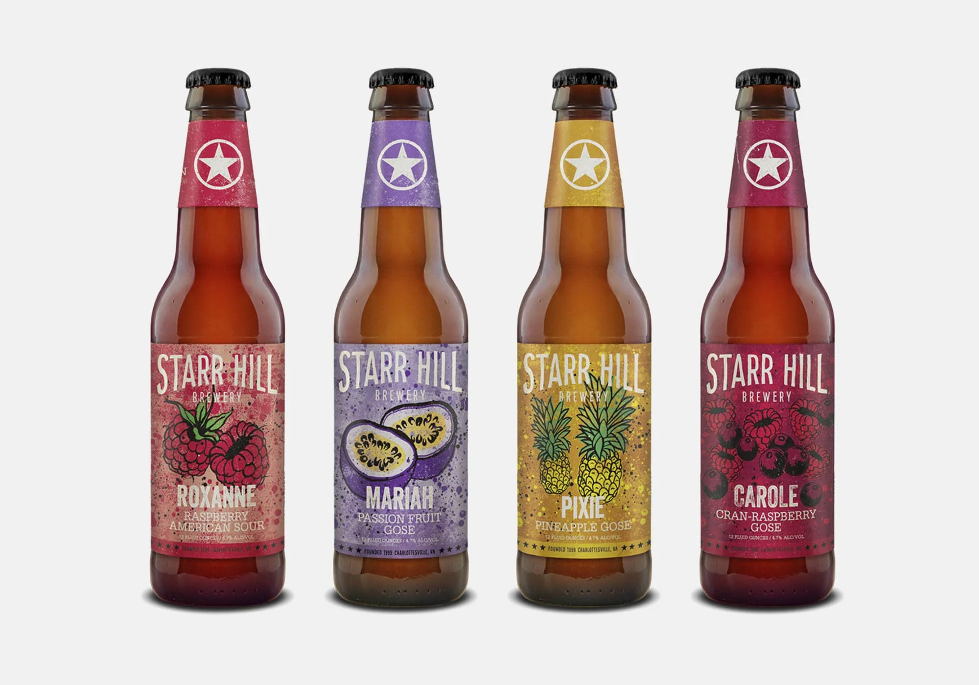
Starr Hill Brewery distributes its beers throughout the mid-Atlantic and Southeast U.S. Founded in 1999, Starr Hill wanted to refresh their look while remaining true to its roots in music and Virginia. The identity’s stripped down, handcrafted typography and imagery form the foundations of a consistent visual brand while retaining the brewery’s iconic star logo.
The landscape of central Virginia and the brewery’s roots in music provide inspiration for the packaging. Textures and graphics in the packaging take cues from 60s & 70s rock posters. The bright, simple color palettes are a nod to each beer’s legacy packaging, and define a distinct identity that carries over to tap labels, keg collars, and other print collateral.
market success
Since the introduction of the new design in June of 2015, sales in Starr Hill’s core markets increased by 20% for packaged beer.
more Portfolio Images Coming Soon

