BoClips
Services Provided
Brand Strategy
Visual Identity
Brand Messaging
Transforming Video For The Classroom
Boclips is transforming the way video is used in the classroom by making it easier, smarter, and safer for educators and courseware developers to find and use videos for educational purposes. Boclips needed an updated brand identity that reached both their existing corporate/conservative publisher audience and their new, progressive/imaginative, educator audience.
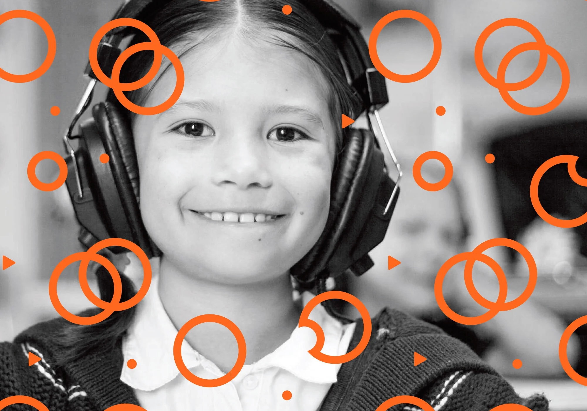
The updated Boclips’ visual identity is geometric, bright and approachable. The logomark references both the brand’s mission and platform through a lens/eye held within four leaves (the Boclips name is derived from the Bodhi tree). Simple patterns and distinctive colors add warmth and personality to the brand, and help set different tones to steer communication towards the intended audience.

